They’re easy to overlook, but contact forms are a vital part of your sales funnel. If you’re running a B2B website that's designed to generate enquiries, your contact forms are probably the last touchpoint in your customer’s online journey. Simply put, they're the element responsible for taking a prospect, and turning them into a qualified lead that your sales team can contact.

They also play a pivotal role in securing the contact information needed to enrol people in your email marketing workflows and the key to effectively nurturing prospects as they navigate the purchase journey. Although be careful about counting form fills as conversions.
It can be tempting to bash your contact or enquiry forms out in a hurry – using a tool like HubSpot to throw something together in 5-10 minutes before parking them at the bottom of your landing page; content in the knowledge that they’ll probably convert a decent number of prospects.
But we think there’s a good argument to be made for spending more time on your forms. For researching the latest contact form best practices and experimenting with different designs until you find a form that can maximise your conversion rates.
After all, every market and audiance is different. Irrespective of whether you're trying to get people to download an ebook about cyber security or book a demo of your latest, you need to know exactly what your ideal prospect likes to see in a contact/enquiry form; and provide it with minimal distractions.
Here we’ll look at the anatomy of top-performing contact forms, the research that powers their design and the problems people run into when trying to boost their performance. We’ll also try to provide some actionable advice that can be used to improve the forms on your website.
The Devil Is (Always) In The Detail
There's a real science to designing successful contact forms. A way of building them that maximises your chances of turning web users into paying clients — and eking out extra conversions without any of the legwork associated with drumming up more traffic for your brand.  We’re not talking about radical designs here. Companies like Code Quest have experimented with some truly outlandish forms in the past; featuring interactive elements, hand-drawn graphics and 'gamified' designs that are supposed to to encourage to people to part with their details (source: Site Point).
But we appreciate that this type of 'experimental' contact form can have a negative impact on the way people perceive your website – especially in B2B verticals where radical design is rarely well-received. So we're going to stick to discussing conventional contact forms here.
Interestingly enough, when it comes to conventional examples, research shows that the difference between a good and bad contact form is often fairly minute (source: ACM Digital Library). An extra field or two, a better header, more compelling micro-copy or a simpler layout could literally double your on-page conversion rates, so it’s always worth experimenting with things like:
- Form length
- Form placement
- Form contents
- Field labels
- CTAs
We'll discuss all of these elements in more detail below – including notes on how to experiment with them in a logical fashion and how to interpret your findings, but first, a quick note on contact form best practices and why you should always ignore them.
Contact Form Best Practices – And Why You Should Always Ignore Them
Any discussion about honing in on the 'ideal' contact or enquiry form has to acknowledge the existence of so-called 'contact form best practices'. Google the phrase and you'll find innumerable guides that extoll the virtue of 3 or 5 stage contact forms, enquiry form buttons that drive you to 'book a demo' or forms with a single column layout (source: Marketing Experiments). The problem is that these contact form best practices are prescriptive and do not consider the specifics of your target audiance. B2B buyers are not a homogenous lot. Tempting as it is to assume that they're all motivated or compelled by the same things, the reality is that SaaS customers looking to rejuvenate their project management processes are worlds away from the manufacturing CTOs looking to find a new IT service provider.
Because nobody has tested their form designs on every demographic in the B2B space, we still don't really know what works for various groups. As you'll read in a minute, the results of some length and copy-based tests can be incredibly surprising so if you are trying to design the best-possible contact or enquiry form, forget about best practices.
You need to know what works for your ideal customer, and while a certain amount of audiance profiling will help you to get a grip on their key motivators, the best possible thing you can do is experiment.
Try A/B testing various form layouts. Try switching out all the field names for simpler or clearer examples. Try thirty different button types. The truth is that the anatomy of a successful contact form depends entirely on the preferences of the people it's supposed to convert and you will have to get your hands dirty to find it.
Below, we've tried to give you some different things to think about – and expose you to some of the research around them. We hope this information serves as a good jumping off point; inspiring you to try different things and providing a solid foundation to work from.
But if you're more interested in prescriptive 'rules for success' this article (and the world of CRO) may not be for you.
Size Matters, But Not Like You Think
A lot of people assume that short contact forms have a higher conversion rate. As mentioned above, a quick Google search for “contact form best practices” brings up hundreds of articles extolling the virtues of four or five field forms; forms that can be completed in less than 3 seconds or forms that take up less than half of the viewport. And it’s easy to see how people have reached this conclusion. We’re constantly told that people’s attention spans are shrinking. That people don’t have time to waste online, or that web users will always take the path of least resistance.
But it’s important to note that these ideas fly in the face of recent research conducted by conversion giants like Venture Harbour, Kissmetrics or Hubspot.
In fact, a Venture Harbour study published in 2021 showed that reducing the number of fields on a contact form could actually drop your conversion rate by up to 14.23%, and there’s plenty of evidence to support the idea that long (10+ field) web forms can convert traffic if they’re set up properly (source: Venture Harbour).
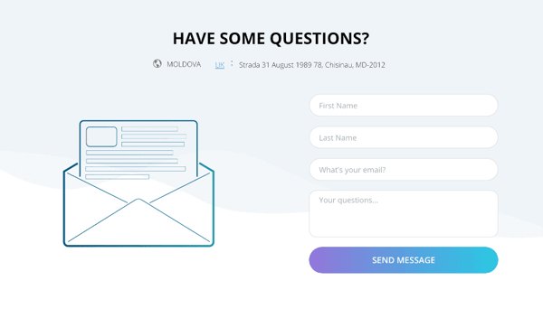
Forms like this one from Choice Screening:
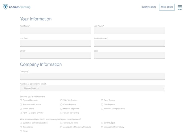
Why? Well, pause for a second and put yourself in your customer’s shoes. If you’re trying to sign up to a newsletter or a you probably don’t want to spend 10+ minutes giving someone your phone number, maiden name, town of birth and shoe size. But if you’re enquiring about a high value service it’s probably reassuring to know that your prospective supplier cares about the fine detail.
And it’s also important to note that you’ll be in a very different headspace to the customers trying to download an eBook or sign up to a newsletter. You’re expecting to go back and forth with sales reps, read lots of documentation or . You’re preparing to engage in a process so it makes sense that you’d be happy to spend a few minutes filling out a form.
Of course there’s still a lot to be said for shorter forms too, but it’s important to spend some time thinking about:
- The amount of information you actually need to qualify a prospect
- The amount of information your prospects expect to be asked for
- The length of time you’d be happy to spend filling out a form for similar services
- Industry-specific expectations around the amount of detail needed to provide a quote or follow up on an enquiry
We think it’s well worth reflecting on these points for a day or two, and then plotting out a couple of different forms. Experiment with length, add and subtract fields, play until you arrive at a length that’s right for your website, product or service.
Ultimately, you may find that you end up like the aforementioned case study - with a 10 step form that takes minutes to fill.
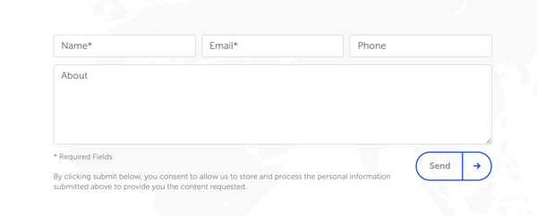
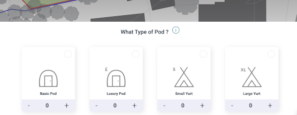
Alternatively, you might find that your website performs much better when you run 3 field enquiry forms like the one we built for Separo:
But you won’t know until you get testing, so try to take the guesswork out of the equation and set up some A/B tests on high-traffic landing pages.
This will give you a clear indication of your audience’s expectations and allow you to start building a contact form template that you can roll out across the rest of your site.
Multi-Stage Contact Forms Could Be The Answer
If you think long forms are killing your conversions but you need extra detail to qualify your leads, it may be worth experimenting with multi-stage contact forms. We don’t see many of these forms in the wild, but research suggests they may outperform single-stage variants. A case study published in 2020 showed that switching to two-stage conversion form actually helped one business generate an impressive 59% increase in the volume of qualified leads coming from their website (source: Venture Harbour).
And Hubspot says that multi-stage or multi-step contact forms built on their CMS generally convert 86% higher than their single-stage cousins (source: HubSpot).
Why? Well, we’ve already established that some people are put off by long or complicated forms, but multi-stage forms often look quite short. At first glance, you’re only being asked to fill in a few fields and by the time you’ve realised there’s a second or third step you’re invested in completing the enquiry - which may explain why they have relatively high conversion rates.
Breaking your form fields into manageable chunks also allows you to arrange them so that low friction questions - like your desired outcome, your enquiry type or your field of interest - can be front-loaded, while high-friction fields asking for personal information can be left till last.
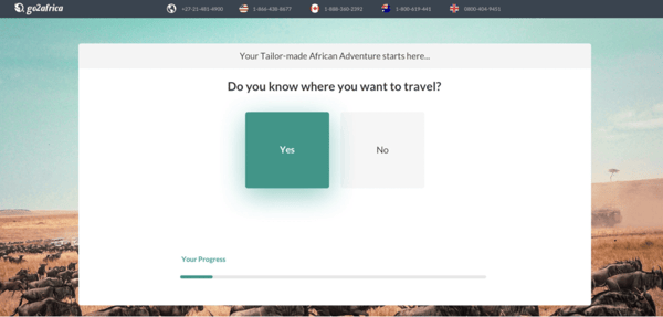
The enquiry form the Grey Collective built for Go2Africa is a great example:
There’s no guarantee that switching to multi-stage forms will boost your conversion rate, but we think there’s some real potential here. Especially if you’re trying to gather a lot of information about your prospects.
The Placement Of Contact Forms Can Be Key
Placement is just as important as length. Bury your contact form at the bottom of your landing page and there’s a good chance your prospects will never see it. After all, research from ClickTale shows that only 22% of web users scroll to the bottom of a landing page (source: UX Myths). But that doesn't necessarily mean that you should stick your contact form at the top of the page either. How many times have you enquired about a product before reading a bit of blurb? Or reached out to a business before you’d seen their credentials, reviews or qualifications?
You need some context to build trust, mitigate niggling concerns and ‘warm up’ your leads which is why a lot of experts say that it’s preferable to place your contact forms below the fold. Or build a scrolling contact form that follows people down the page.
That’s not to say that top-of page contact forms never work. We know - from first hand experience - that they can be very effective but they tend to work best when you’re selling a very specific product to a pre-engaged audience, or pushing a service to people with a big problem that needs fixing immediately.
Think leaking oil wells or overflowing warehouses, rather than considered purchases like managed IT services for a growing business or digital marketing for B2B companies.
So when you’re placing your contact forms, try to think about how much information your prospects need to read before they’ll convert. Think about the flow of the page and the place where you’d expect people to start thinking “I want to pop these guys a message”. That way you’ll avoid putting people off by appearing too eager and circumnavigate the challenges associated with getting eyeballs on the bottom of your landing page.
Field Labels, Titles and CTAs Matter Too
Now that we’ve dealt with the length and placement of high performing contact forms, it’s time to take a look at the contents. Most contact forms are fairly straightforward: You’d expect to find a title at the top of the form, a small paragraph of text, some field labels and a CTA/button that can be clicked to send the forms. A 2014 research paper that looked at eye tracking data to generate best practices for form design found that field labels should always appear above the corresponding fields; that you should always opt for a single column layout and that one question per row was ideal (source: ACM Digital Library).
Another study published by CXL showed that tweaking field names to be slightly more descriptive could increase conversion rates by 19.2% (source: CXL).
Now, we’ll be the first to admit that these studies aren’t definitive. Every audience is different and there’s no guarantee that these findings will bear out for your site but it’s still worth considering these findings:
Could you tweak your form labels to mitigate your user’s concerns? Or re-arrange them to reduce friction? Could something as simple as re-jigging your form so that it was easier to process encourage people to fill it in or switch the layout to improve flow?
Optimising Your Call To Action – A Worthwhile Exercise
Finally, it’s worth thinking about the language used on your submission button. Research published by Hubspot shows that asking people to ‘submit’ information has a negative impact on your conversion rates (shaving off approx 3% of conversions). Meanwhile more imaginative options like:
- Click here
- Get started
- Go
- Get in touch
All perform considerably better in controlled experiments (source: HubSpot).
Explaining the "why" of microcopy is probably best left for a dedicated deep-dive on the subject. But if you're not really convinced that changing a word can lift your conversion rate, it's worth considering your target audiance.
As mentioned in many of our inbound marketing blog posts, B2B buyers have a very specific mindset. They are motivated by - and irritated by - things that often surprise us, which is why paying close attention to things like the use of aspirational/motivational phrases often has a disproportionately significant impact on the relative performance of contact/enquiry forms.
Simply put, someone who considers themselves self-starters may prefer more engaging language. People who are pressed for time may want to read direct copy that tells them exactly what they're getting when they fill in a contact form, and everybody wants transparency when it comes to working out what's about to happen with their personal data (source: CXL).
Taking the time to test small tweaks to your button text can make all the difference to your conversion rates, so don’t be afraid to experiment with a few different options.
Disguising Your Contact Forms Might Help
In some spaces, people are so reluctant to fill out a contact/enquiry form that it actually pays to disguise them as something more innocuous/value-driven. In recent months, we've had a lot of success building 'calculators' for B2B clients in land permitting/construction niches. These calculators are multi-stage; asking visitors to divest a few (basic) details about their project before asking for contact information – so that our clients can send them a personalised quote. The approach works for a couple of reasons: Firstly, people feel like they're more likely to get something of real value (ie. a quote that's based on the realities of their project).
And secondly, we're giving people a tangible reason to part with their information. "contact us" isn't really specific or direct. You don't really know whether you're going to be invited to a Zoom meeting, or rung by an irritating sales-person at half past eight on a Friday night. 'Tell us about your project and we'll send you an accurate and personalised quote' is much more explicit and sets expectations appropriately.
Now, we're not saying that calculators are applicable to every industry or B2B niche but if you are struggling to make traditional contact/enquiry forms work and you're in a space where some details need to be gathered before a quote can be issued, they may be worth a shot.
What Next?
Hopefully this article will inspire you to go away and start experimenting with your contact forms. If you’re feeling overwhelmed or you’d like to chat about overhauling your own enquiry forms, we’re always happy to have a friendly chat. Our team of marketing experts are well placed to help you build out a testing strategy or brainstorm ideas.  Our experienced dev team are also well placed to help you build some shiny new forms and you'll find a wealth of additional information about conversion rate optimisation, generating leads and general digital marketing on our blog.
Assuming that you are here because you're keen to get more leads out of your website, you may also be interested in learning more about inbound marketing – a methodology developed to suite the intricacies of B2B buyer journeys.
We've written an in-depth guide to CRO for B2B businesses here, and we're always happy to talk through the finer points via Zoom, Teams or whatever video messaging service you're using post-lockdown.