When it comes to Conversion Rate Optimisation (CRO), innovation is normally driven by flashy eCommerce sites like Amazon, Adidas or Apple. The people with 100,000+ daily visitors and the confidence to experiment with things like shoppable search, AI-powered mega menus and one-step checkouts that are designed to encourage impulse purchases.

B2B companies prefer to tread a more traditional path; many still serving up uninspired websites that are difficult to navigate and frustrating to use. Websites that spend so much time extolling the virtues of their parent company or waffling about vanity projects that they struggle to generate enquiries and leave their visitors feeling underwhelmed.
Maybe it’s fear. Maybe there’s a knowledge gap or a fixation with tradition that’s stifling innovation. We could speculate all day, but there’s no getting round the fact that B2B companies are slower to innovate with their websites.
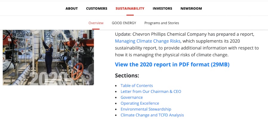
Giants like Phillips 66 still depend on outdated designs that are crippled by poor functionality, and even smaller, more nimble B2B businesses like Square seem reluctant to embrace the customer-first approach that enables sites like amazon.com to generate 9.55% conversion rates.
And that’s a real shame, because investing in CRO can yield impressive results for any business.
B2B or B2C: The Same Lessons Apply
There’s a temptation to assume that B2B websites are wholly separate and disconnected from their B2C counterparts. To kid yourself into thinking that they play by a different set of rules, or persuade yourself that their target audience has unique expectations that can only be met by leaning on conservative designs.
As a B2B web design agency, we think differently.
Years of near-constant optimisation have trained most of us to expect certain things from a website. Things like short contact forms that you can fill out in under 30 seconds, or video content on long landing pages.
Things like highly-visible CTAs and accessible search bars that provide near-instantaneous access to the content you want to read. Quality of life features that make it easy for you to find what you’re looking for and even easier to convert on an appealing offer.
The people browsing your B2B website have the same expectations.
See, C-suite executives, buyers and financial controllers still spend hundreds of hours browsing Amazon, or ASOS, in their free time. Engaged or not, they’ve spent days of their lives passively absorbing all of the design tweaks and shortcuts that make B2C websites so effective.
And if we’re not replicating these innovations on our own sites then we’re definitely missing a trick, because people will not engage with a website that doesn't meet their expectations.

People Aren’t Patient
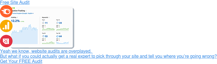
Case in point: DashThis, a US-based SaaS company, recently discovered that they were struggling to convert clients because their buttons were the wrong colour.
This isn’t an over exaggeration or a tall tale either: They spent months struggling to convert qualified prospects before they finally turned to HotJar and realised that their target audience were glossing over the elements that were supposed to help them engage with their free trial of the product, including the buttons that let them link external marketing data to the platform and create a custom dashboard for their business.
But none of their customers came to them and said “excuse me, I can’t work out how to use your platform”. They just left the site and never came back.
So don’t be like DashThis. Don’t sit there while your site drives customers away and fails to deliver on the promises made by your marketing when the solution is right in front of you.
Getting the Fundamentals Right
We could write a book about the many lessons B2B sites need to learn about CRO, but we’ll focus on a few cut-and-dried examples here. If you’re keen to know more then get in touch - we’re always happy to talk your ear off about conversions, A/B testing and user-centric design.
Visual Hierarchy
Effective web pages tell a clear and coherent story. Visitors are led from point to point and important elements leap off the page; grabbing your attention and forcing you to engage with a promise, an offer or a benefit.
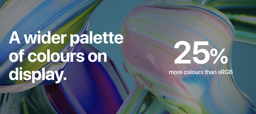
Think about the way that Apple has structured the landing page for their MacBook Air: Scrolling through, you’re exposed to a list of increasingly compelling features and benefits.
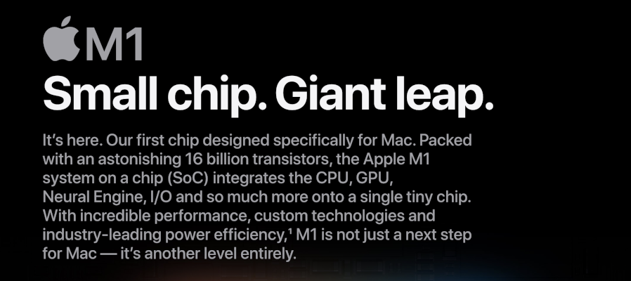
Glossy images and animations force you to engage with the strongest offers and bold titles ensure that you register the product’s unique selling points.
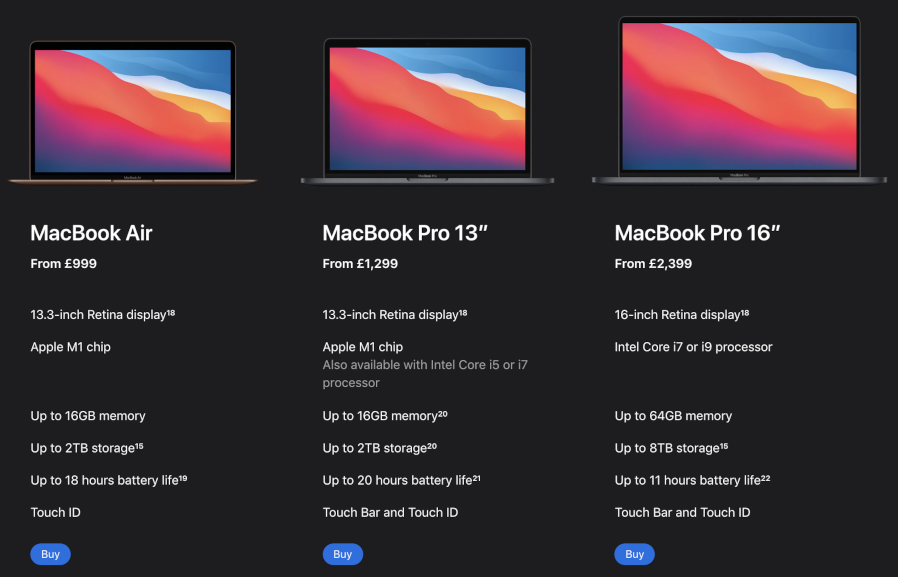
It’s a masterclass in visual hierarchy, and it’s worth noting that the page culminates with a simple and straightforward CTA: You’re pointed at 3 versions of the product and asked to pick one so there’s absolutely no confusion about your next step.
But sites with poor visual hierarchy confuse their visitors. You’re left wondering where you’re meant to focus or find yourself drifting from section to section like a rudderless sailboat, bereft of direction or purpose. Elements compete for space and visitors end up bouncing away because they can’t find what they’re looking for.
The Phillips 66 sustainability page is a great example. It looks glossy and impressive, but the CTAs are inconsistent, there’s no story to follow and it’s hard to parse the information on the page.
Our advice? Emulate Apple instead. Your sales team will thank you for it.
Establishing Trust
People won’t convert if they don’t trust you. B2C websites combat this problem by littering their landing pages with important trust signals. Product reviews and trust seals, credit card logos in the site footer and links to active social media accounts that paint a picture of a brand that's engaged with its audience.
B2B companies can also inspire trust, but they have to be more intelligent about it. Adding client logos or testimonials to relevant pages, building detailed case studies, adding badges or logos that communicate expertise or making sure that they’ve got a detailed ‘team’ page.

Establishing trust is probably one of the most powerful ways to improve your site’s conversion rate, but you have to do it carefully. Go too hard and you’ll look like you’ve got something to prove, which is why we always recommend adding trust signals that are contextually relevant, convincing and well-thought out.
Read our in-depth guide to building trust online here.
Making It Easy To Convert
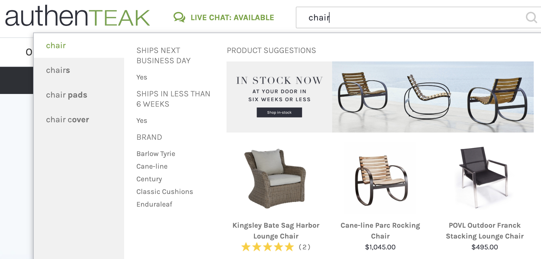
Sites like Amazon, Osprey or ASOS make it easy to convert. There are buy buttons on every product and category page, you can shop directly from the category menus and some B2C sites are even creating shoppable on-site search results so that you can fill your basket without leaving the homepage.
They make sure that you’re never more than a click away from making a successful purchase but a lot of B2B sites take a different approach: Hiding enquiry forms on specific service pages or redirecting people to a generic contact page.
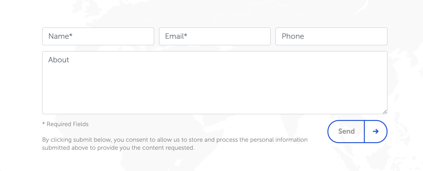
Many B2B sites also gate conversions behind long and laborious enquiry forms, despite the fact that shorter forms like the one pictured below often boast much higher conversion rates.
There’s also some interesting research into the use of multi-stage forms for B2B businesses that need to gather a lot of data before a conversion so if you think that your 8 or 9 field form is the only option, it might be time to think again.
Read our guide to building top-performing contact forms here.
Using Simple Language
Ever heard of the plain English campaign? It’s a (rapidly-growing) movement that’s fighting for clearer English in public communication.
And there’s a reason that it’s gaining popularity: People are slowly losing their reverence for convoluted jargon and unnecessarily dense prose.
Claiming that you specialise in “driving lasting transformation by providing the enhanced capabilities needed to enable organisations to grow and thrive in the digital age” no longer inspires confidence or awe in your readership and numerous studies suggest that people are becoming increasingly impatient with brands that lean on this kind of complex ‘legalese’.
So we recommend that our clients find simple and coherent ways of communicating their benefits. Working hard to create messaging that resonates with their audience and compels action instead of wasting time sounding clever.
To us, this is just as important as designing the right menu or picking the right image and we're happy to say that a lot of B2B companies are slowly waking up to the importance of effective messaging.
Read our in-depth guide to writing in plain English here.

Testing Everything
Successful companies test every assumption. Even the common-sense recommendations that we’ve made here are highly dependent on your target audience and the expectations set by your marketing.
Some companies may find that dense and wordy landing pages are more likely to convert, or that 14 field enquiry forms inspire more trust.
Some people may even find that adding highly visual CTAs or site search bars seems to annoy their client base but there’s simply no way to tell without testing, which is why learning how to A/B test absolutely everything is the key to successful CRO.
The Future of CRO for B2B Websites
We're not huge on the word revolution but there’s no point mincing words. The B2B landscape is due for a serious shake up and we expect to see a lot of B2B companies experimenting with CRO over the next few years.
Think your website could benefit from an expert eye? We offer CRO to B2B clients in a number of industries. You can read all about the offering on our website or get in touch to talk to a member of our team.