
 By David Robinson
If you're reading this, there's a decent chance your engineering website looks fine and does almost nothing. It loads, it's tidy enough, the products are all listed, and yet the phone doesn't ring and the contact form gathers dust. We see it constantly, and it's usually not a design problem at all. It's that the site was built to describe the business rather than to win work from the people quietly researching their next supplier.
We're Red Evolution, and we've spent more than twenty years redesigning websites for engineering, oil and gas and manufacturing firms. We'll be straight with you about something most agencies won't admit: a redesign that starts with how the site looks is a redesign that's already gone wrong. Engineering buyers don't behave like consumers, the people selling to them shouldn't pretend they do, and the way you plan the project has to reflect that.
So this is the honest version. No talk of "conversion architecture" without explaining what we mean, no pretending a new homepage will fix a broken sales process. Just the steps we actually walk clients through, the mistakes we've made ourselves, and what to watch for so you don't tear down rankings it took years to build.
Why engineering websites need a different approach
Most redesign advice is written for shops and SaaS companies, where someone sees a thing, wants the thing, and buys the thing inside a week. Your world doesn't work like that, and you know it. A technical buyer might spend three months quietly reading before they ever speak to you, the decision involves an engineer, a procurement lead and probably someone in the boardroom, and nobody on that list is going to be charmed by a stock photo of a handshake.
That changes everything about a redesign. You're not building a shop window, you're building something that has to earn the confidence of sceptical, technical people across a long, slow buying process, often without you ever knowing they were there until the enquiry lands. If you want the full picture on selling into those drawn-out processes, our guide to marketing for complex B2B sales cycles goes deeper than we can here.

Start with how your buyers actually decide
Before anyone touches a colour palette, work out how your ideal customer gets from "we've got a problem" to "let's call these people". It usually runs through four rough stages, and your website needs an answer ready at each one.
First they realise they've got a technical headache that needs outside help or kit. Then they go looking, searching for capabilities, specifications and approaches that might solve it. Then they start comparing suppliers on track record, technical fit and whether the commercials stack up. And finally, several people who weren't part of the early research turn up to sign off the decision, each with their own questions.
Here's the bit most people skip: you already have this information, you're just not using it. Sit down with your sales team and a few recent customers and ask what they were worried about at each stage, what nearly put them off, and what tipped them over into making contact. Those answers are the raw material for the whole redesign. We've lost count of the times a sales engineer has casually mentioned the one question every prospect asks, a question that appeared precisely nowhere on the existing website.
Give your current site an honest kicking
Now go back to your live site and look at it through that buyer's eyes, not your own. For each stage of the journey, ask whether someone could actually find the thing that answers their current worry, whether your technical content shows you know your stuff without burying them, whether your proof (accreditations, case studies, real client names) shows up at the moment a decision is being weighed, and whether it's even obvious what you'd like them to do next.
In our experience, engineering sites fall into one of two traps. Either they read like a technical manual with no hint of a next step, all spec and no welcome, or they've swung the other way and gone full consumer-brochure, big claims and soft focus, with none of the depth a real buyer needs to trust you. Be honest about which one you are. Most firms know in their gut before the audit even confirms it. If you want a structured way to do this, including looking at what your rivals get right, we wrote about how to interrogate your competitors' websites for exactly this reason.
Decide what you want people to do
A lead generation website isn't a digital brochure, it's a series of invitations, and not everyone's ready to accept the same one. Someone three months from a purchase isn't going to fill in a "request a quote" form, and slapping one in their face just makes you look like you weren't listening.
So think in terms of how much someone's willing to commit. At the low-commitment end you've got things like a downloadable guide or a newsletter sign-up, which capture early researchers who aren't ready to talk yet. In the middle sit things like a technical specification download or a webinar place, which tell you someone's actively evaluating and probably worth a gentle follow-up. And at the top end you've got the quote requests, consultation bookings and RFQ submissions, the people who are ready to buy and deserve a same-day reply, not a "thanks, we'll be in touch".
Map each of those to actual pages, and make sure the path is obvious rather than hidden three clicks deep in a menu nobody opens. If you're starting from scratch on this thinking, our guide to building a lead generation website lays out the whole approach.

Organise the site around buyers, not your org chart
Engineering websites tend to grow like a workshop that's never been tidied. A new capability gets bolted on here, a product range there, and after a few years the navigation is a mish-mash that makes perfect sense to you and none at all to a visitor. A redesign is your chance to impose some order, so take it.
The trick is to organise around how buyers think, not how your business is structured internally. Some firms do best grouping by the sectors they serve, so an oil and gas buyer lands somewhere that feels built for them. Others organise around the problems they solve, like reducing downtime or meeting a compliance standard, because that's the language the buyer is searching in. And plenty organise around capabilities, the design, manufacture, testing and maintenance of it all. There's no single right answer, but whichever you pick, the main navigation has to reflect what the buyer cares about, not which department shouts loudest at the planning meeting.
Earn trust the way engineers grant it
Engineers are sceptical by training, and quite right too. They're not going to take your word that you're "a leading provider of innovative solutions" (please don't ever write that), so your website has to earn their confidence with evidence rather than adjectives.
The strongest thing you've got is case studies with actual numbers in them. "Reduced inspection time by 40%" does more work than a paragraph of "improved operational efficiency", because one is a claim and the other is a result. Worth knowing, though, that nobody reads case studies the way you hope they do, which is exactly why we wrote about why nobody reads your case studies and how to fix that.
Beyond that, give people genuinely useful technical content, the guides and spec sheets and calculators that help an engineer do their job, because when your content makes someone better at their work your credibility goes up without you saying a word about yourself. Put your accreditations and ISO standards where they actually matter, next to the points where someone's deciding, not buried in a footer on the About page. And for goodness sake, put names and faces to your technical team. Buyers want to know they'll be working with people who know their stuff, not an anonymous sales inbox.
Don't torch your search rankings
This is the one that keeps us up at night, because a redesign is where years of hard-won search visibility quietly dies if nobody's paying attention. Your buyers lean heavily on search to find suppliers, often for very specific technical requirements, so throwing away your rankings on launch day is an expensive way to celebrate.
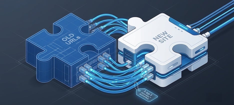
Plan your content around the words your buyers actually type, which in engineering tend to be low-volume but high-intent, the kind of specific phrase that brings you one visitor a month who's worth more than a thousand tyre-kickers. Get the technical fundamentals right, clean URLs, fast pages, sensible mobile experience, and above all map your redirects properly so every old page points to its new home. We've inherited the aftermath of redesigns where nobody did this, and watching a client's organic traffic fall off a cliff is genuinely painful. If search is new ground for you, start with our plain English guide to SEO before you go anywhere near a migration.
Treat launch as the start, not the finish
A redesign isn't a project you finish and forget, it's the beginning of an ongoing process of paying attention. Before you go live, make sure your analytics are set up so you're tracking enquiries and how people move through the site from day one, your redirects are mapped and tested, and there's no placeholder text lurking on a page you forgot about (it happens, and it always gets spotted by a prospect rather than you).
After launch, actually look at the thing. Which pages generate enquiries, where do people give up and leave, and what questions is your sales team still answering for the hundredth time because the website doesn't? Every one of those is a clue about what to improve next. The best engineering sites we've worked on are never really "finished", they just keep getting quietly better, which is the whole idea behind growth driven design.
The mistakes we see again and again
Having redesigned a fair few of these over the years, the same own goals keep cropping up, so learn from other people's instead of your own. The big one is putting how it looks ahead of what it does, because a beautiful website that doesn't generate enquiries is just an expensive ornament. Close behind is ignoring mobile, on the assumption engineers only browse from a desk, when plenty are checking specs on a phone from a site office or a train.
Then there's copying whatever your biggest competitor did, which guarantees you look like everyone else at the exact moment you're trying to stand out. There's launching with half-finished content and placeholder copy, which quietly tells visitors you don't sweat the details (not a great message from an engineering firm). And there's the rankings one we've already banged on about, because we'd rather repeat ourselves than watch you learn it the hard way.
Where to go from here
If your current website isn't pulling in the quality or volume of enquiries your business needs, a buyer-focused redesign is very often the fix, but only if it's built around how your buyers actually decide rather than how you'd like the site to look. Everything above is what we'd walk you through if you were sitting across the table from us.
If you'd like a second pair of eyes on your existing site, we're happy to take a look and tell you straight what we'd change, no hard sell and no obligation. Drop us a line for a quick chat, and if all you get out of it is a clearer idea of what's holding your site back, that's a decent result in our book.