

Hoover Pumping Case Study
Growing Website Traffic, Driving Leads & Accelerating Growth
Delivering:
- Website Refresh
- SEO
- CRO
- Digital PR
Helping Hoover's Website Compete
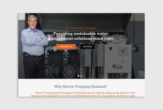
Hoover manufacture, install and maintain irrigation systems for businesses in Florida. They’re innovators, designing hyper-efficient pump stations and remote management systems that massively outperform their competitors.
They’ve also been in business for 40+ years and have a genuine commitment to environmental sustainability – saving clients millions of gallons of water every year (not an exaggeration!)
But when we first started working with Hoover, they were struggling to differentiate themselves in an increasingly competitive space.
Competitor sites were taking the lion's share of the traffic, they were struggling to turn visitors into leads and they weren't getting the traction they deserved.
The Challenge
Standing Out From The Crowd
Hoover operate in a crowded vertical. They're going toe-to-toe with entrenched players that have massive marketing budgets and they're also working in a hide-bound industry, where risk-averse buyers prefer to go with solutions that seem to be 'tried and true', even if doing so jeopardises their bottom line or increases the environmental impact of their activities.
Like many B2B companies, Hoover also face the unenviable challenge of pitching a considered purchase to a cold audience, which means that the look and feel of their website has to be spot on, while attracting people at the right part of the buying process, presenting a compelling story and providing all the credentials needed to build trust.

The Solution
A Smart New Strategy
We started with keyword research, using a plethora of tools to work out how people researched and bought irrigation systems for commercial properties in Florida.
Having identified that Hoover were not showing up for the most important phrases, we set about building a digital marketing strategy that'd allow us to reach the people searching for what they do, and turn them into Hoover customers.
A Fresh Look & Feel
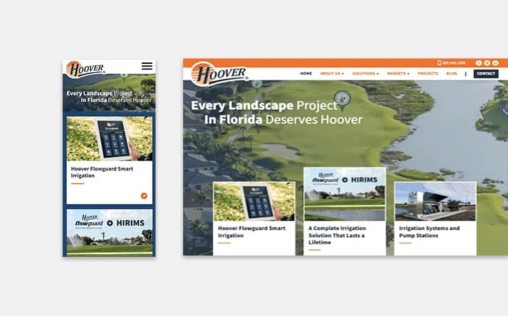
To help fuel Hoover’s ambitious growth plans, we then set about refreshing the look and feel of their website: Travelling out to Florida to meet with the team, getting to know the business, and brainstorming ideas enabled us to create an updated design that'd speak to their brand values.
Designing A Better UX
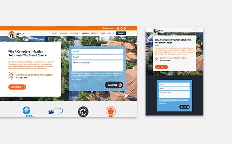
Highlighting important content, guiding people to key pages and providing compelling CTAs is key to making sure that your website generates leads.
When we got stuck into Hoover's site, we made sure the new design would steer prospective customers towards the elements that were best-placed to reassure and delight their target audience.
Pushing The Envelope
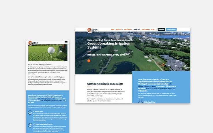
Some agencies spend a lot of time making shiny websites that look good, but don't drive business. We prefer to take a data driven approach, but we're still well aware of the need to produce websites that look and feel fantastic.
With Hoover's site, we spend a lot of time building gorgeous video headers and elements that'd speak to the natural beauty of Florida, and help them to stand out from the competition.
Re-optimising Pages
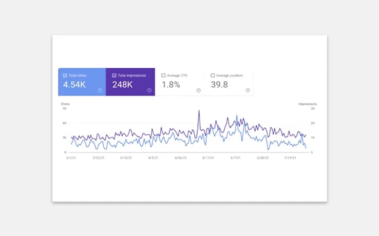
There are many ways to skin a cat. Often, agencies will jump straight into writing new content, but we recognised a few quick wins that'd help Hoover scale in months - rather than years.
We managed to repurpose a slew of existing pages; altering URLs, heading and body copy to ensure they'd rank for high-value search phrases.
Creating New Content
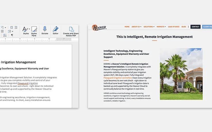
Having started the ball rolling, we turned to our in-house content team – drawing on their expertise to write new pages that sought to answer real questions; address pain points and bring search traffic flooding onto the Hoover site.
We also built out pages that told a compelling story about Hoover's expertise, and the quality of the solution on offer.
Building Trust
Speaking of important signals, we also set about adding trust-building elements to the Hoover site.
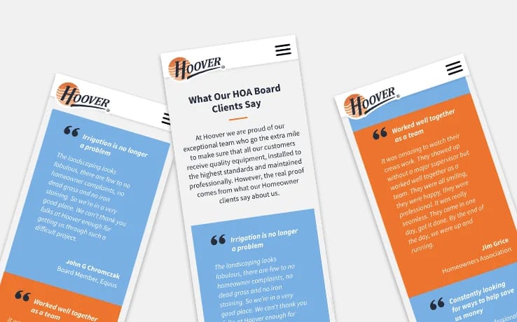
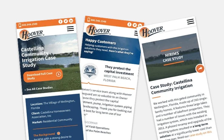
Certification logos, case studies, customer testimonials and team imagery were put at the front and centre of the site so that potential customers could get a good feel for Hoover's credentials – and the level of service they provide.
The Outcome
The results speak for themselves
We've helped to deliver
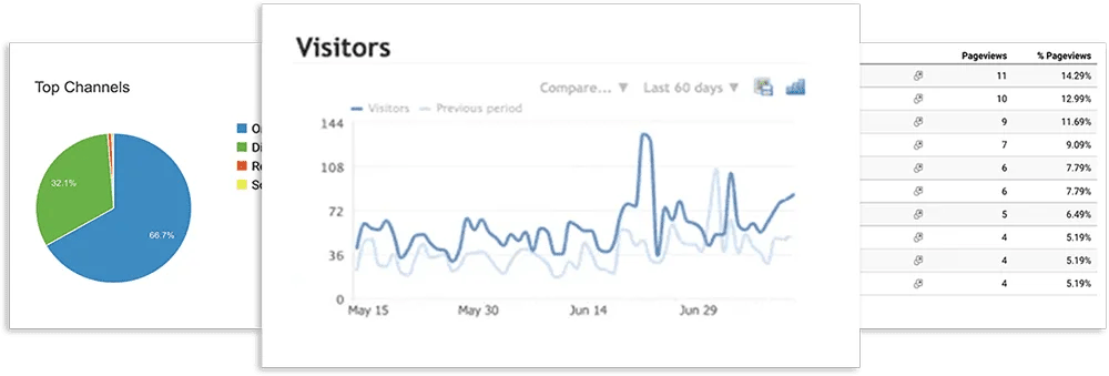
115.46%
INCREASE IN YOY ORGANIC TRAFFIC
149.59%
INCREASE IN NON-BRANDED TRAFFIC
18%
INCREASE IN VISITORS REACHING KEY CONTACT FORMS
Would You Like To Discuss Your Requirements?
You'll find our plain English approach refreshing, so please use this form to tell us about your project, and we'll contact you to arrange a convenient time to discuss it.
If you'd prefer to book a meeting right now, at a time that suits you, you can do that here.
We won't share your information or use it for any purpose other than to contact you to discuss your requirements.